
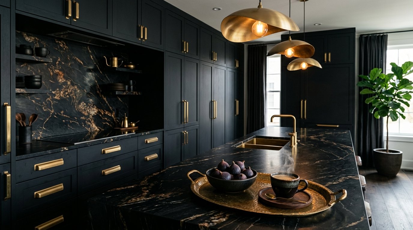
Are you tired of staring at the same sterile, all-white kitchen cabinets that look exactly like everyone else’s on your social media feed? The kitchen is the heart of the home, yet it is often the most visually safe room in the house out of a fear of making the “wrong” design choice. However, upgrading your kitchen’s color scheme is one of the highest ROI projects you can undertake, radically shifting the atmosphere without necessarily requiring a full gut renovation.
By utilizing premium materials, consulting a good hardware buying guide, and selecting the right cohesive palette, you can achieve a bespoke, designer look. Whether you are budgeting for professional services to spray your cabinets or looking for a weekend DIY project, bringing color into your culinary space is the ultimate way to create a tailored, high-end environment. Get ready to transform your space with these 14 genius kitchen color palette ideas you need to try this season!
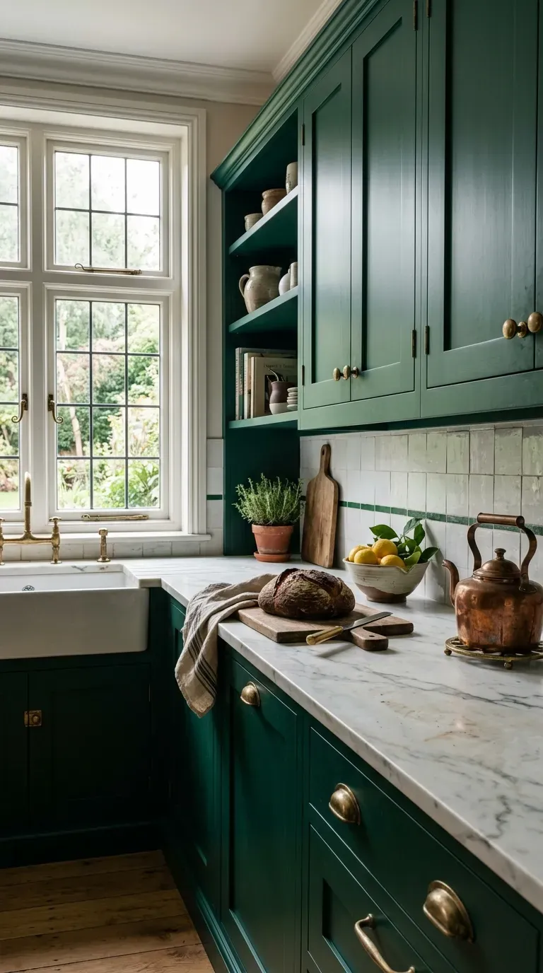
1. Moody Emerald Green & Unlacquered Brass
Rich, deep emerald green cabinetry is dominating high-end kitchen design. When you pair this dark, forest-inspired hue with unlacquered brass hardware, you create a timeless, sophisticated space. The brass acts as an investment piece, naturally aging and developing a gorgeous patina over time that contrasts beautifully with the sharp green. If you are using 3D rendering software to plan your layout, you will immediately see how this combination grounds a large kitchen space.
Why This Idea Works
Psychologically, deep greens evoke a sense of calm, abundance, and nature. Aesthetically, the dark tone recedes, making the room feel incredibly expansive, while the brilliant brass hardware acts as “jewelry” that catches the eye and breaks up the heavy color block.
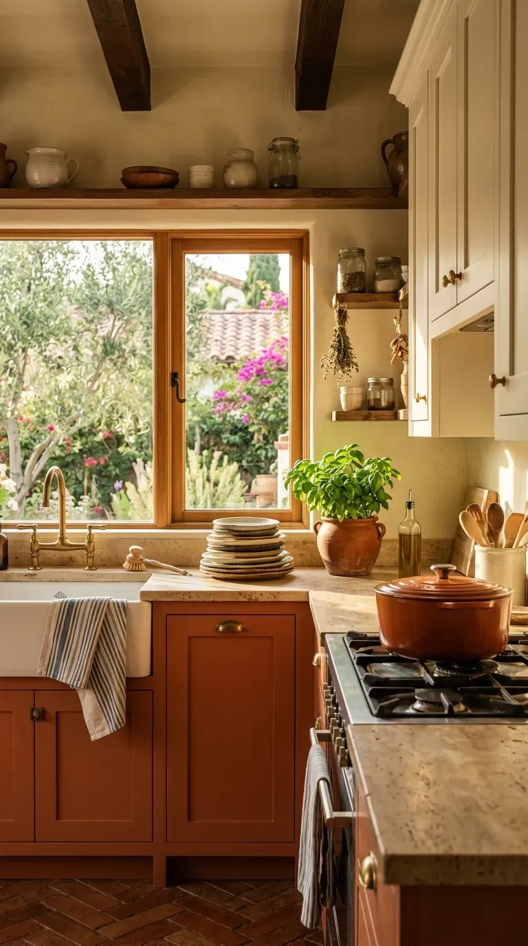
2. Warm Terracotta & Creamy White
If you want your kitchen to feel like a sun-drenched Mediterranean villa, terracotta and creamy white is the ultimate pairing. Use a soft, baked-clay hue on the lower cabinets and a warm, milky white on the uppers. This two-tone approach is a fantastic budget vs. luxury hack; it allows you to introduce bold color without overwhelming a small space, giving you that custom European look without the massive expense of imported tiles.
Why This Idea Works
Terracotta inherently warms up a space, stimulating the appetite and making the kitchen feel incredibly inviting. By keeping the upper cabinets white, you ensure the eyeline remains bright and airy, preventing the room from feeling cave-like.
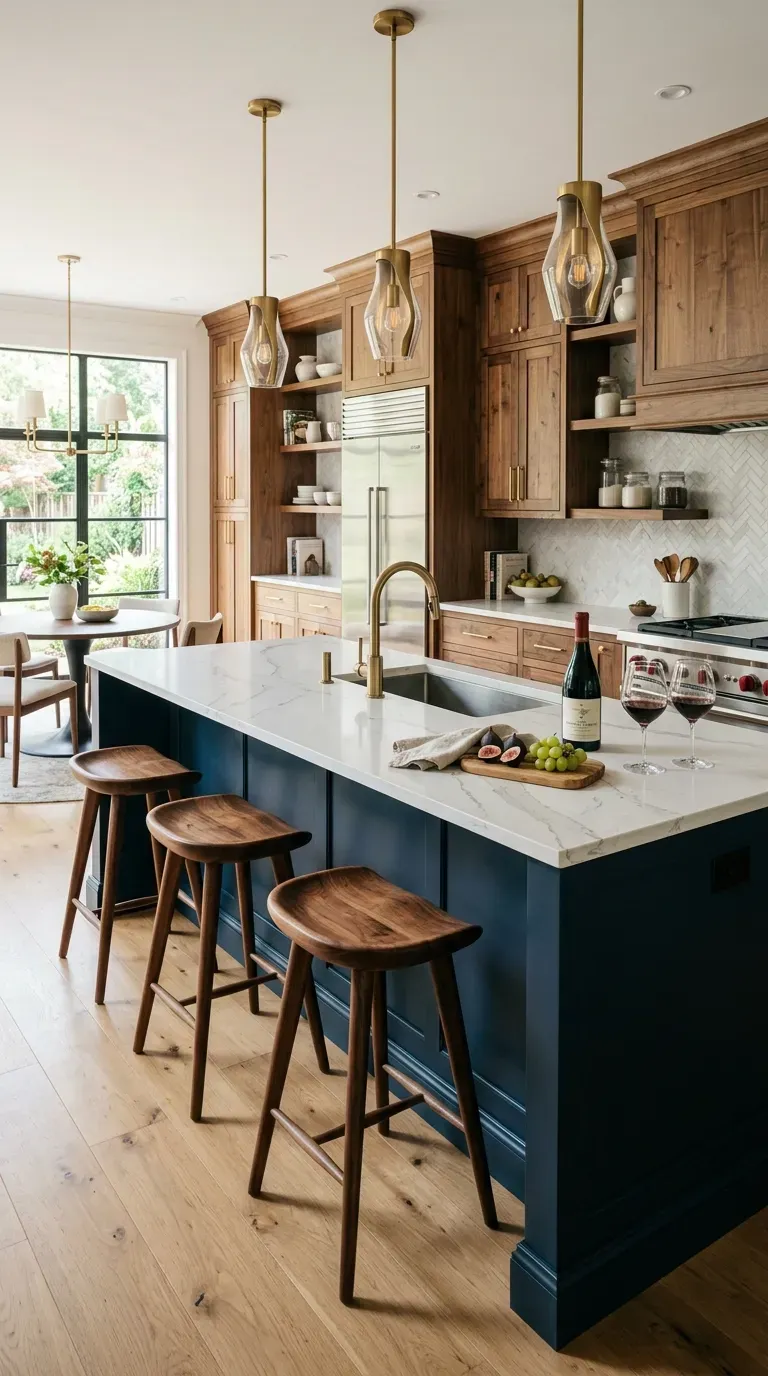
3. Midnight Blue & Natural Walnut
For a sleek, transitional aesthetic that bridges the gap between classic and contemporary, combine deep midnight blue with natural, warm walnut wood accents. Whether you use blue for the perimeter cabinets and a solid walnut slab for the island, or vice-versa, the result is incredibly luxurious. When sourcing your wood, consult a premium materials supplier to ensure the walnut has a durable, food-safe finish.
Why This Idea Works
The cool, severe tones of midnight blue are perfectly balanced by the organic, chocolatey warmth of the walnut. It creates a space that feels both highly tailored and incredibly earthy, appealing heavily to both modernists and traditionalists.
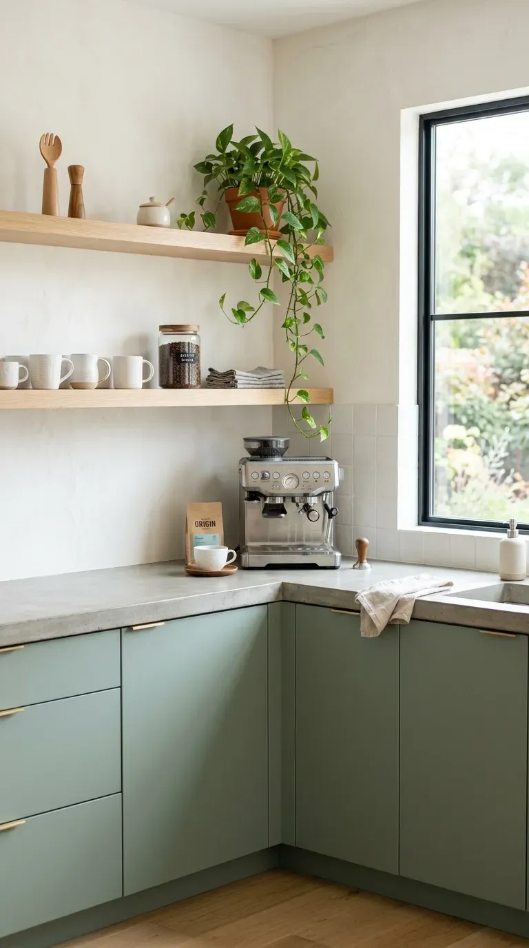
4. Soft Sage Green & White Oak
Sage green and white oak is currently one of the most requested palettes by professional interior design services. It offers a muted, organic vibe that feels incredibly fresh. The grayish-green tone acts almost like a neutral, while the pale, whitewashed oak brings in a trendy Scandinavian influence. This palette looks especially stunning when paired with honed quartz or concrete countertops.
Why This Idea Works
Sage green is highly restorative and easy on the eyes, making it perfect for a room where you spend a lot of time working. The combination of muted green and pale wood brings strong biophilic elements into the home, blurring the line between indoor and outdoor spaces.
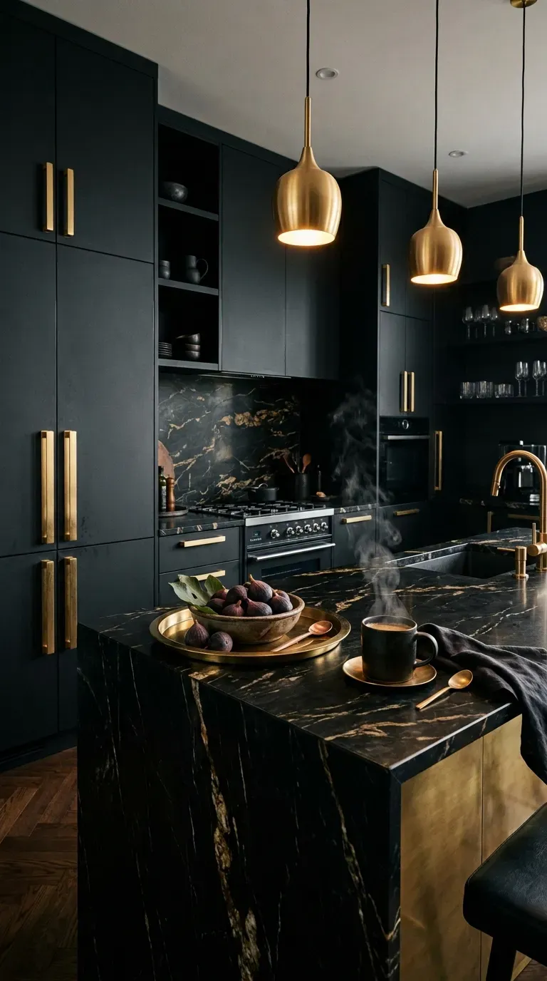
5. Dramatic Charcoal Black & Warm Gold
Don’t be afraid of the dark! A fully charcoal or matte black kitchen is a show-stopping design choice that screams luxury. To prevent it from looking like a cave, it is crucial to use the best tools for lighting design—incorporating heavy, warm gold or brass light fixtures and hardware to bounce light around the room. This palette is incredibly forgiving when it comes to hiding everyday kitchen grime.
Why This Idea Works
Black creates an atmosphere of deep intimacy and severe elegance. The high-contrast pop of warm gold against the matte black surface instantly elevates the perceived value of the cabinetry, making standard MDF look like custom millwork.
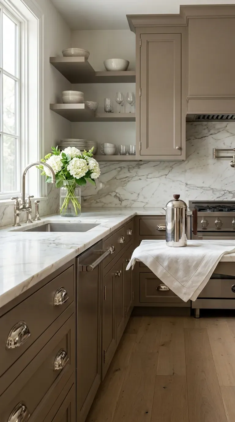
6. Earthy Mushroom & Polished Nickel
Move over, standard gray. “Mushroom”—a complex, earthy blend of gray, beige, and subtle brown—is the new go-to neutral for high-end kitchens. When you pair this grounding, muddy tone with the cool, mirror-like finish of polished nickel hardware, the result is effortlessly chic. If you are doing a DIY paint job, relying on a step-by-step tutorial for proper priming will ensure this delicate color applies flawlessly.
Why This Idea Works
Mushroom is a “chameleon color” that shifts beautifully depending on the time of day and the lighting. It provides the warmth of beige without the outdated yellow undertones, while the polished nickel adds a crisp, sanitary gleam that is essential in a food prep space.
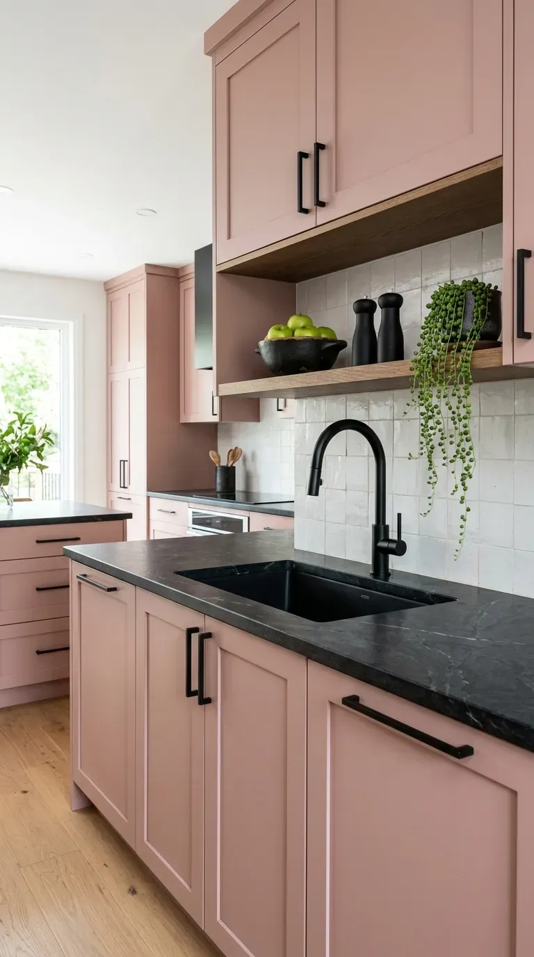
7. Dusty Rose & Matte Black
Pink is no longer relegated to nurseries. A sophisticated, muted dusty rose brings unexpected warmth and joy into a kitchen. To keep the space from looking too sweet or juvenile, anchor the pink cabinetry with stark, modern matte black hardware, black faucets, and dark countertops. Utilizing interior design software to test this bold choice beforehand can give you the confidence to execute it perfectly.
Why This Idea Works
The tension between the soft, feminine dusty rose and the harsh, masculine matte black creates a brilliantly balanced visual dynamic. It is a playful yet highly sophisticated palette that instantly makes the kitchen the most talked-about room in the house.
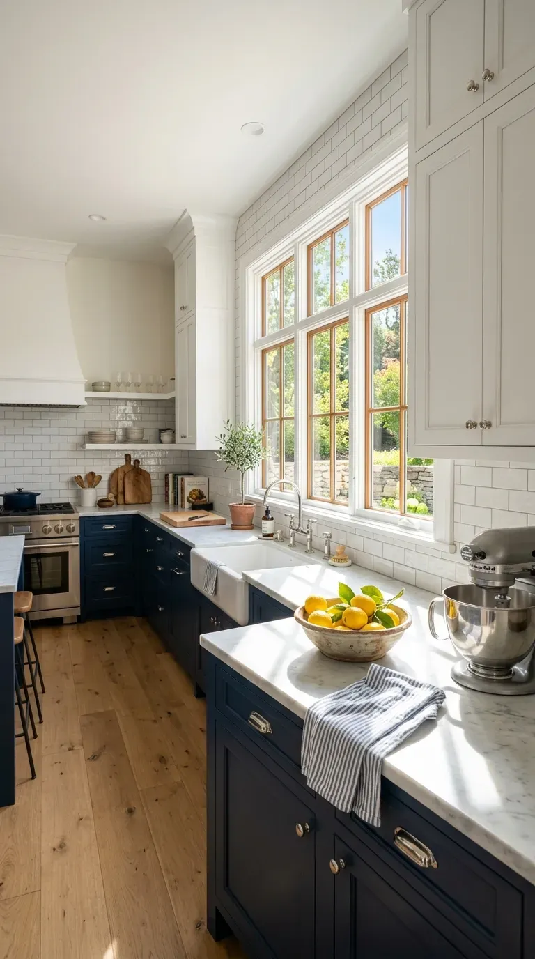
8. Classic Navy Blue & Crisp White
You can never go wrong with a classic nautical palette. Navy blue lower cabinets paired with crisp, bright white upper cabinets and subway tile backsplash is a fail-safe design that stands the test of time. It is highly recommended by real estate professionals as a way to add personality without alienating future home buyers. Make sure to consult a kitchen buying guide to find a heavy-duty, scrubbable white paint for those uppers!
Why This Idea Works
This palette utilizes the concept of visual weighting: the dark navy grounds the lower half of the room, while the white upper half seemingly disappears into the ceiling, making the entire kitchen feel taller, brighter, and immaculately clean.
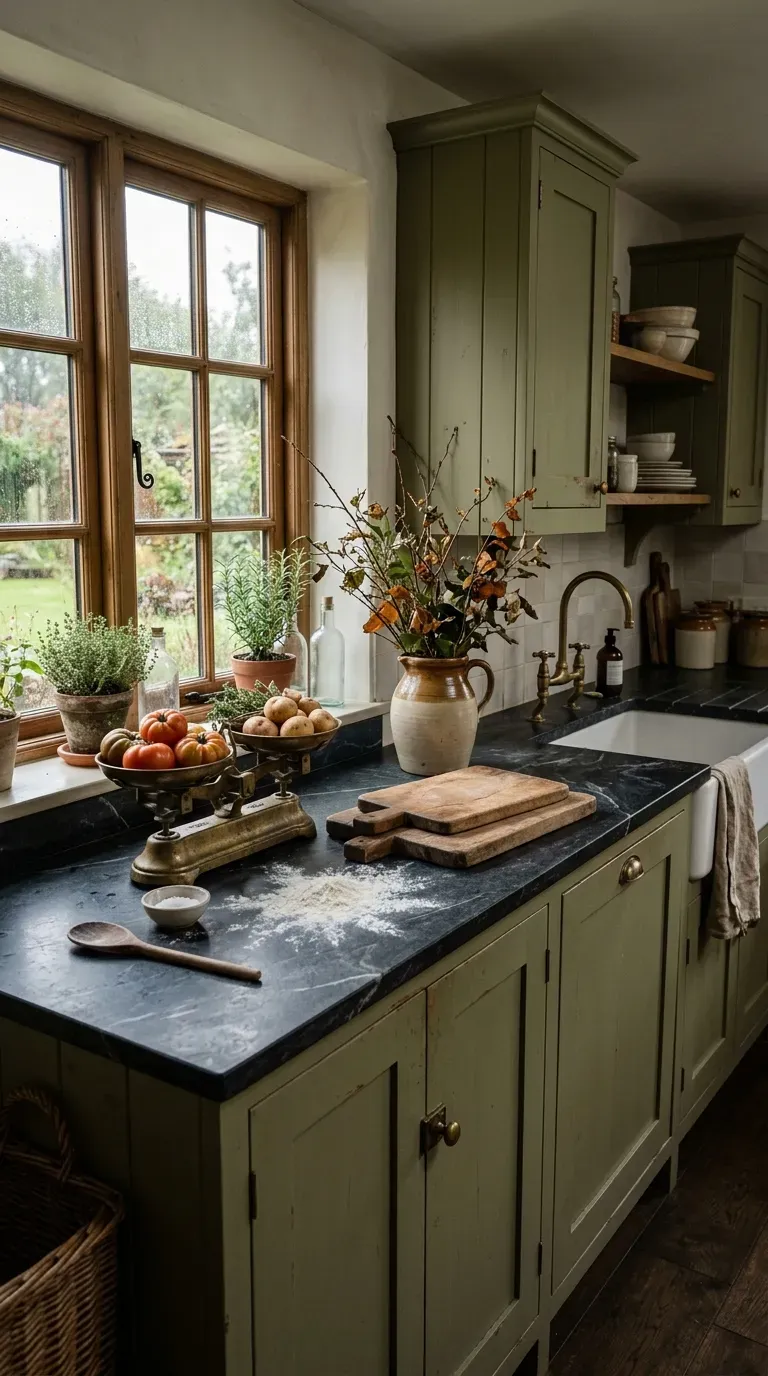
9. Olive Green & Soapstone
For a rustic, heritage-inspired kitchen, pair muted olive green cabinets with dark, veined soapstone countertops. Soapstone is a phenomenal premium material that is naturally antibacterial and heat resistant. The combination feels historic and grounded, reminiscent of a grand English country house.
Why This Idea Works
Olive green has rich yellow and brown undertones that make a space feel incredibly cozy and lived-in. When paired with the dark, matte, chalky texture of soapstone, it creates a tactile, earthy environment that encourages slow cooking and gathering.
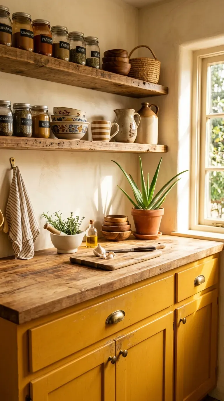
10. Sunbaked Ochre & Raw Wood
Inject massive amounts of energy and warmth into your home with a sunbaked ochre (mustard yellow) color palette. Paired with raw, unstained wood elements—like floating shelves or a butcher block island—this palette screams bohemian creativity. It is a fantastic choice if you want to achieve a high-design look on a tight budget, as it pairs beautifully with affordable, must-have equipment like basic white subway tile.
Why This Idea Works
Ochre is a highly stimulating color associated with happiness, energy, and creativity. By tempering the brightness of the yellow with the rustic, grounding texture of raw wood, the design remains sophisticated rather than looking like a fast-food restaurant.
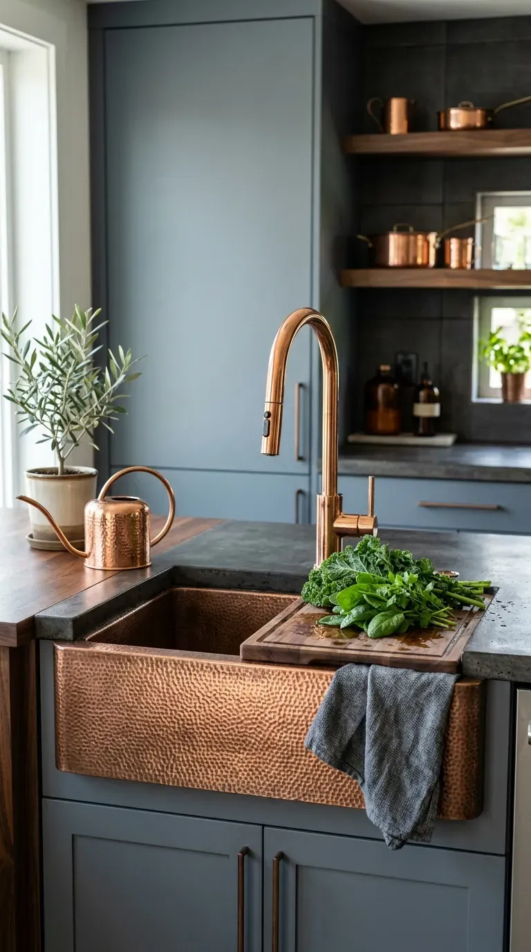
11. Slate Grey & Warm Copper
Step away from standard stainless steel and embrace the metallic warmth of copper. Painting your cabinets a cool, stony slate grey provides the perfect, moody backdrop for hammered copper sinks, copper pendant lights, and exposed copper piping. Copper fixtures are true investment pieces that naturally develop a living finish, changing and deepening in color the more you use them.
Why This Idea Works
The icy, blue-toned undertones of slate grey perfectly complement the fiery, orange-red tones of copper on the color wheel. This high-contrast pairing looks incredibly bespoke, industrial, and highly intentional.
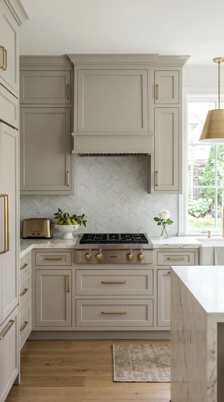
12. Greige & Brushed Brass
“Greige” (the perfect blend of gray and beige) is the ultimate safe-but-stunning neutral. It brings more warmth than stark gray and more modernity than traditional beige. Elevate this subtle color by pairing it with brushed brass or champagne bronze hardware. If you are hiring professional services to paint your cabinets, greige is universally crowd-pleasing and will easily boost your home’s resale value.
Why This Idea Works
Greige is the ultimate chameleon, adapting to both cool morning light and warm artificial evening light beautifully. The brushed brass adds a touch of understated glamour that makes the space feel expensive and carefully curated without being loud.
13. Deep Plum & Honed Marble
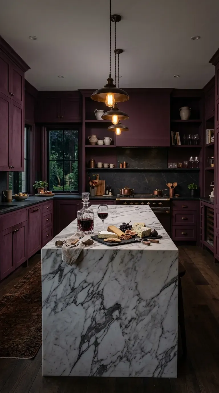
For those who want true dramatic luxury, deep plum (a dark, muted purple-brown) is an avant-garde choice that pays off massively. Pair these incredibly rich cabinets with honed (matte) white marble countertops featuring heavy gray veining. This is a palette that demands premium materials to execute correctly; the natural, unpolished look of the honed marble prevents the dark cabinets from feeling too heavy or gothic.
Why This Idea Works
Plum is the color of royalty, wine, and luxury. It brings a decadent, velvety depth to the kitchen that feels incredibly intimate. The matte finish of the honed marble provides a modern, tactile contrast to the rich wall of color.
14. Two-Toned Pastel Blue & Cream
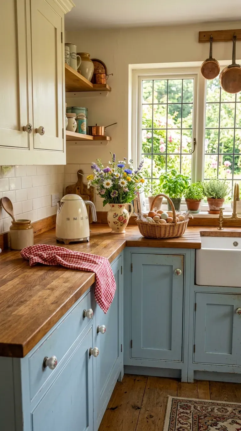
Bring a breath of fresh air into your home with a delicate, two-toned palette of pastel robin’s egg blue and warm cream. This combination is highly favored in cottage-core and vintage-inspired designs. To get the proportions right, use software tools to visualize the blue on the bottom and the cream on top. Finish the look with vintage glass knobs and butcher block counters for a nostalgic, inviting space.
Why This Idea Works
Pastel blue is inherently soothing and nostalgic, evoking clear skies and calm waters. Pairing it with cream instead of stark white softens the overall contrast, creating a gentle, welcoming environment that feels like a cozy country retreat.
Conclusion: Bring Your Kitchen Color Palette to Life
Your kitchen does not have to be a sterile, purely utilitarian space. By stepping slightly outside of your comfort zone and utilizing these genius color palettes, you can completely transform the heart of your home into a personalized, high-end sanctuary. Whether you invest in premium materials like unlacquered brass and soapstone, or take the budget-friendly route of painting the cabinets yourself, a fresh coat of color yields the highest visual return on investment possible.
Now it’s your turn: Which of these 14 kitchen color palettes are you most excited to try in your own home? Let us know in the comments below, share this article with your favorite DIY partner, and don’t forget to save/pin this post to your Home Decor Pinterest board for inspiration during your next renovation!